
Agente 86
Time to pick it up again
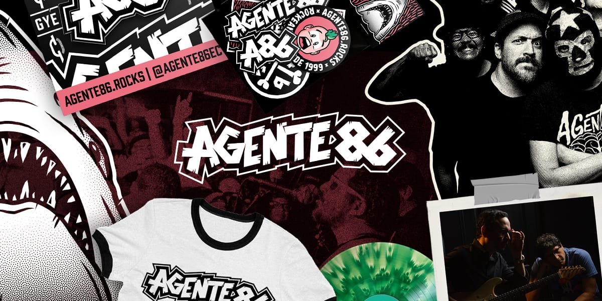
After years of being mostly inactive, Agente 86 was getting ready to release a new single and announce an upcoming record. We needed a visual direction that could bring the band back into focus, support a month-long merchandise campaign, and give this new chapter a distinct personality.
I led the creative and art direction, designing everything from the identity and single artwork to the merchandise, website, social content, email campaigns, and motion.
Time to pick it up again
After years of being mostly inactive, Agente 86 was getting ready to release a new single and announce an upcoming record. We needed a visual direction that could bring the band back into focus, support a month-long merchandise campaign, and give this new chapter a distinct personality.
I led the creative and art direction, designing everything from the identity and single artwork to the merchandise, website, social content, email campaigns, and motion.
Time to pick it up again
After years of being mostly inactive, Agente 86 was getting ready to release a new single and announce an upcoming record. We needed a visual direction that could bring the band back into focus, support a month-long merchandise campaign, and give this new chapter a distinct personality.
I led the creative and art direction, designing everything from the identity and single artwork to the merchandise, website, social content, email campaigns, and motion.
To quote Glenn Danzig, I (We) got something to say...
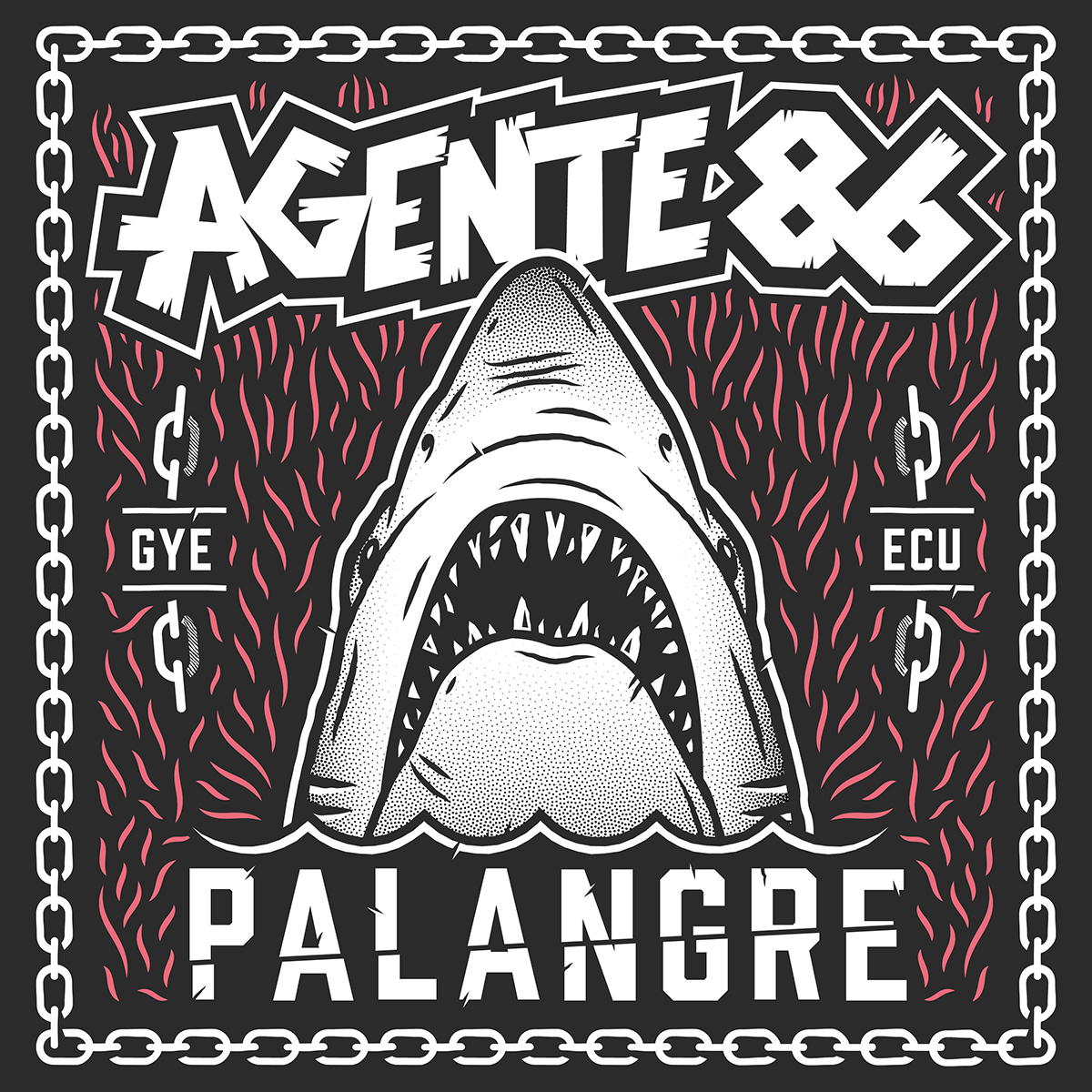
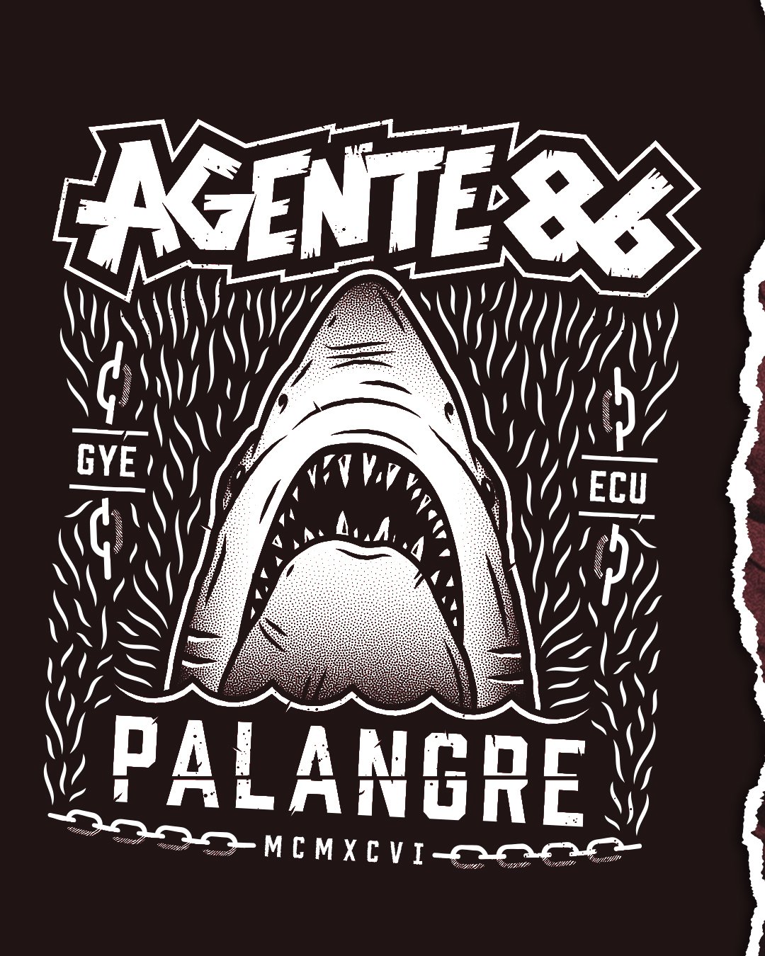
Palangre is the Spanish word for longline fishing. We wrote the song as a protest against the practice in the Galápagos Islands, particularly the killing of sharks.
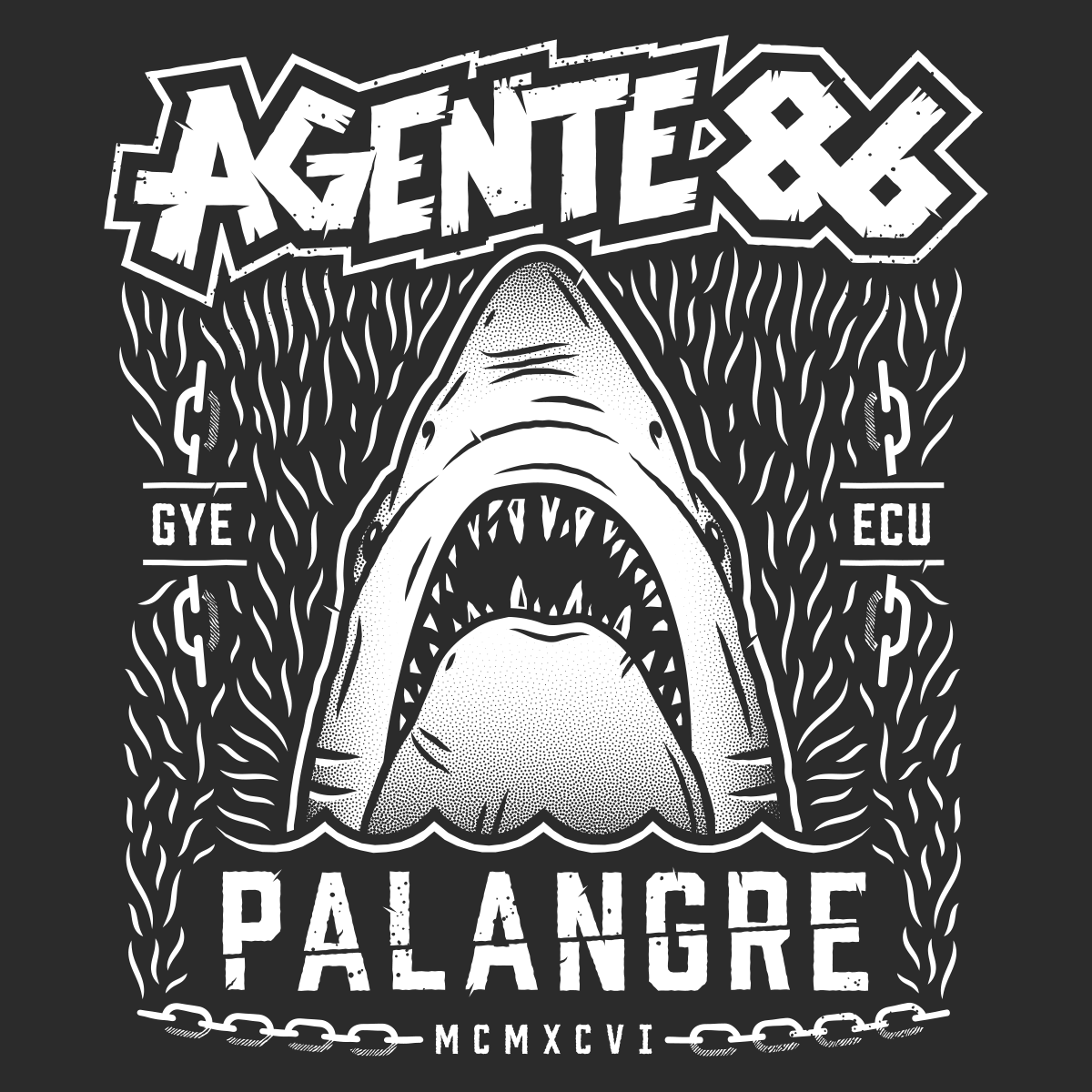
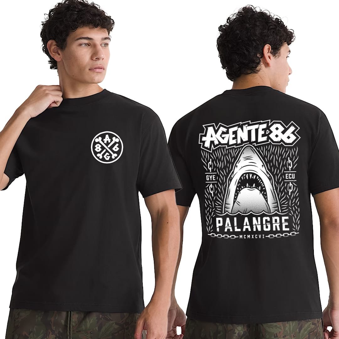
The song felt darker and more aggressive than our usual ska-punk sound, so I wanted the artwork to carry that same energy. I looked to the iconic Jaws poster for inspiration, flipping the idea into a fierce shark emerging from below the surface.
The result became the visual anchor for the release: raw, confrontational, and built to feel like something you could scream from a rooftop.
To quote Glenn Danzig, I (We) got something to say...
Palangre is the Spanish word for longline fishing. We wrote the song as a protest against the practice in the Galápagos Islands, particularly the killing of sharks.
The song felt darker and more aggressive than our usual ska-punk sound, so I wanted the artwork to carry that same energy. I looked to the iconic Jaws poster for inspiration, flipping the idea into a fierce shark emerging from below the surface.
The result became the visual anchor for the release: raw, confrontational, and built to feel like something you could scream from a rooftop.
To quote Glenn Danzig, I (We) got something to say...
Palangre is the Spanish word for longline fishing. We wrote the song as a protest against the practice in the Galápagos Islands, particularly the killing of sharks.
The song felt darker and more aggressive than our usual ska-punk sound, so I wanted the artwork to carry that same energy. I looked to the iconic Jaws poster for inspiration, flipping the idea into a fierce shark emerging from below the surface.
The result became the visual anchor for the release: raw, confrontational, and built to feel like something you could scream from a rooftop.
Finding the Agente 86 look
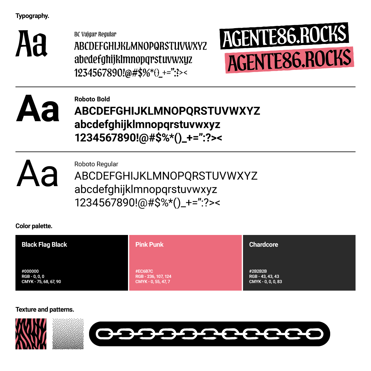
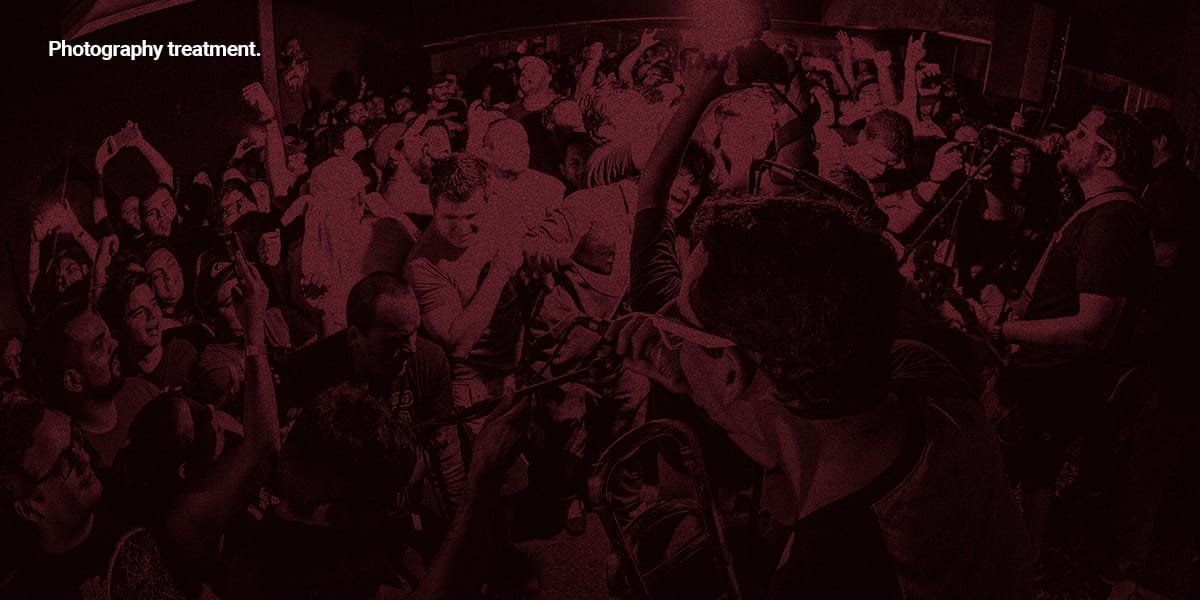
From the beginning, I knew the visual direction had to work across everything we were creating: merchandise, website, social media, email, and video. I drew from old-school punk rock for the typography, colors, photography treatment, textures, and overall attitude.
Rather than treating each piece as a separate design, I developed a visual language that could move between formats while keeping the same raw energy.
Finding the Agente 86 look
From the beginning, I knew the visual direction had to work across everything we were creating: merchandise, website, social media, email, and video. I drew from old-school punk rock for the typography, colors, photography treatment, textures, and overall attitude.
Rather than treating each piece as a separate design, I developed a visual language that could move between formats while keeping the same raw energy.
Finding the Agente 86 look
From the beginning, I knew the visual direction had to work across everything we were creating: merchandise, website, social media, email, and video. I drew from old-school punk rock for the typography, colors, photography treatment, textures, and overall attitude.
Rather than treating each piece as a separate design, I developed a visual language that could move between formats while keeping the same raw energy.
30 years, one logo
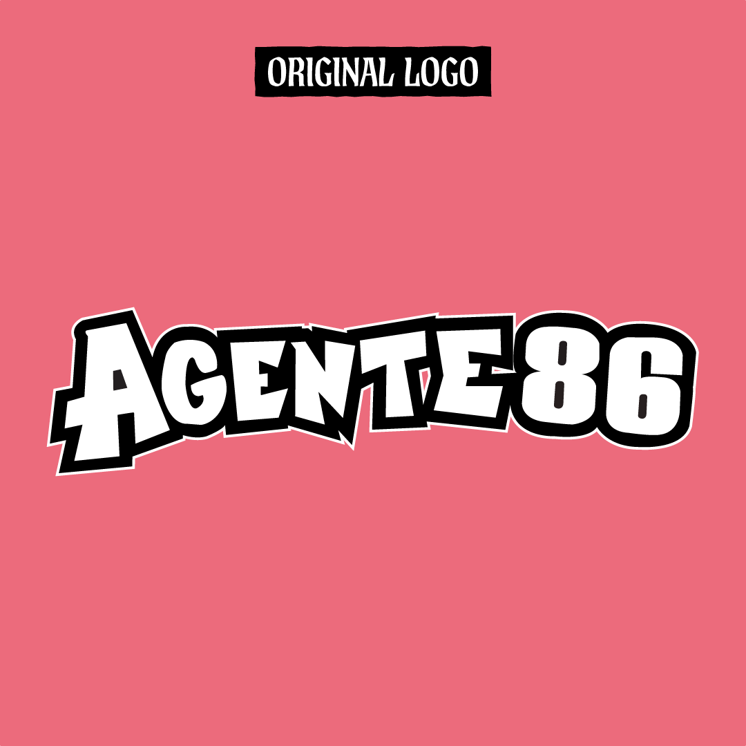
I originally designed the Agente 86 logo in 1996, when I was 15 years old. Thirty years later, I had the chance to revisit it with an entirely different level of experience.
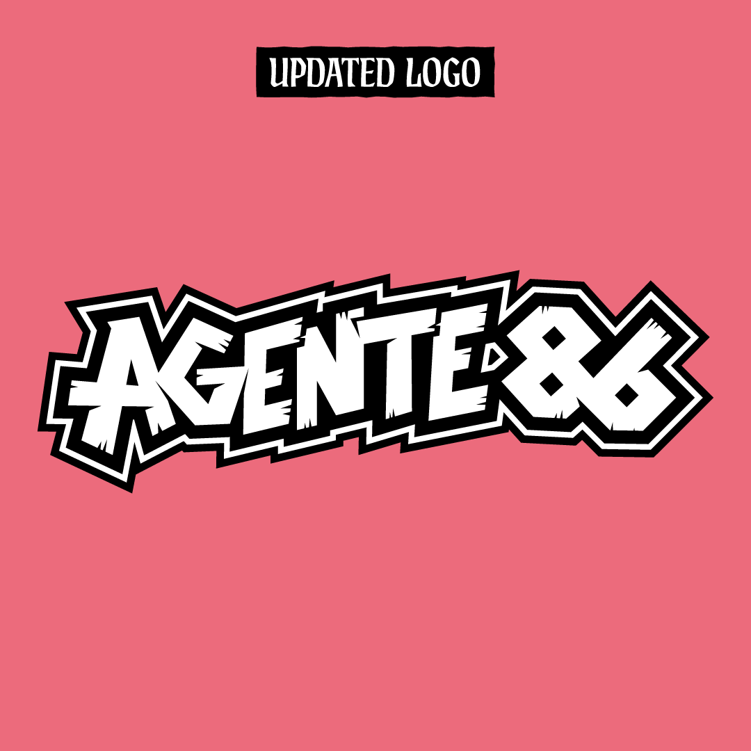
The original logo had become recognizable to the band's audience, so a complete redesign didn't make sense. Instead, I kept its character and rebuilt it with better proportions, cleaner lines, stronger balance, and a more polished finish.
I also created A86 as a secondary mark that could work independently from the full band name.
30 years, one logo
I originally designed the Agente 86 logo in 1996, when I was 15 years old. Thirty years later, I had the chance to revisit it with an entirely different level of experience.
The original logo had become recognizable to the band's audience, so a complete redesign didn't make sense. Instead, I kept its character and rebuilt it with better proportions, cleaner lines, stronger balance, and a more polished finish.
I also created A86 as a secondary mark that could work independently from the full band name.
30 years, one logo
I originally designed the Agente 86 logo in 1996, when I was 15 years old. Thirty years later, I had the chance to revisit it with an entirely different level of experience.
The original logo had become recognizable to the band's audience, so a complete redesign didn't make sense. Instead, I kept its character and rebuilt it with better proportions, cleaner lines, stronger balance, and a more polished finish.
I also created A86 as a secondary mark that could work independently from the full band name.
One visual language, everywhere
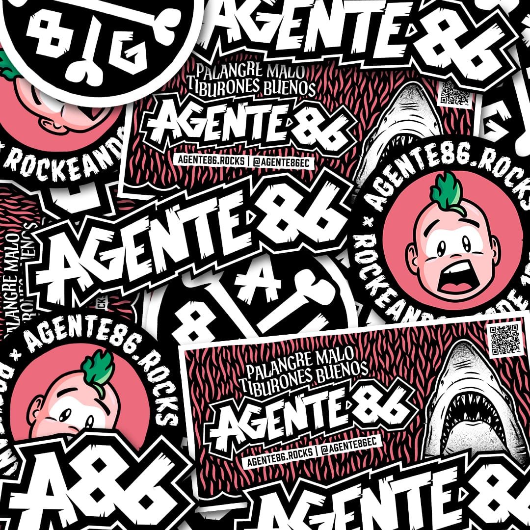
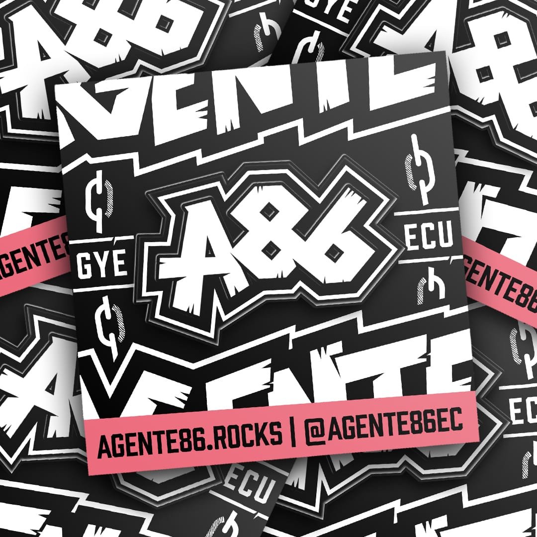
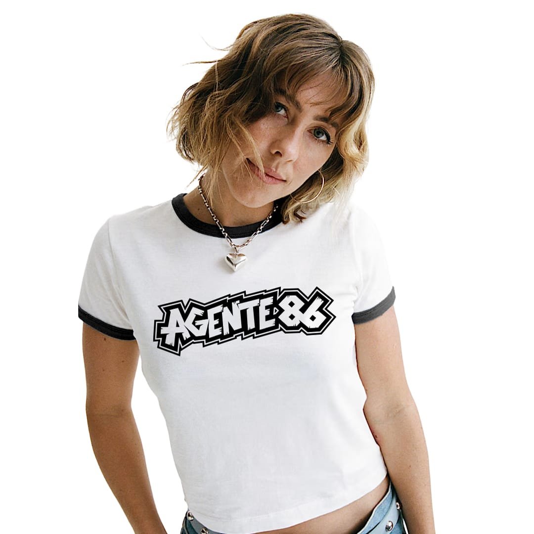
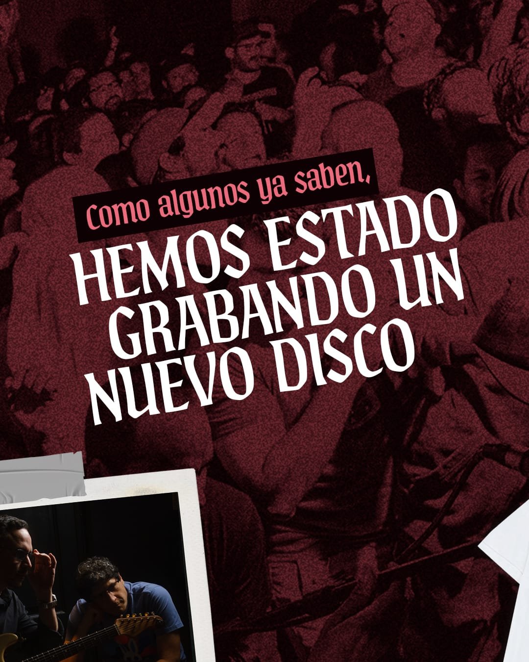
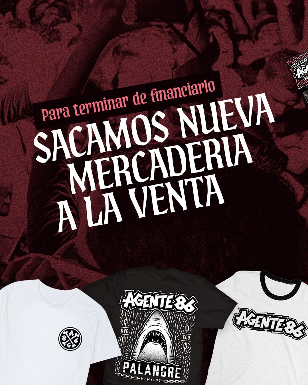
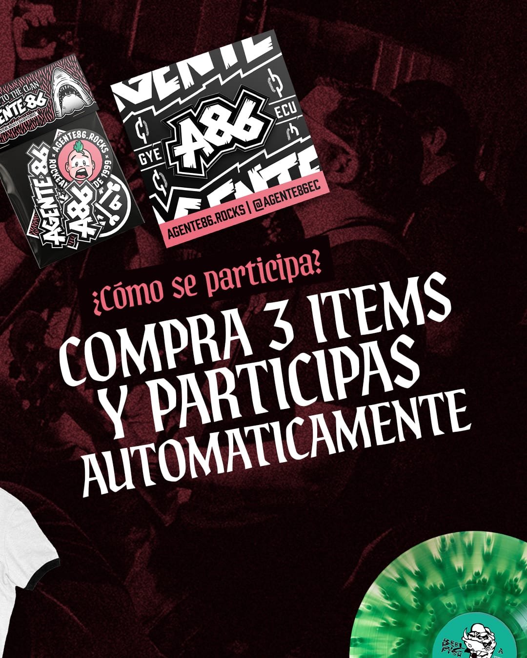
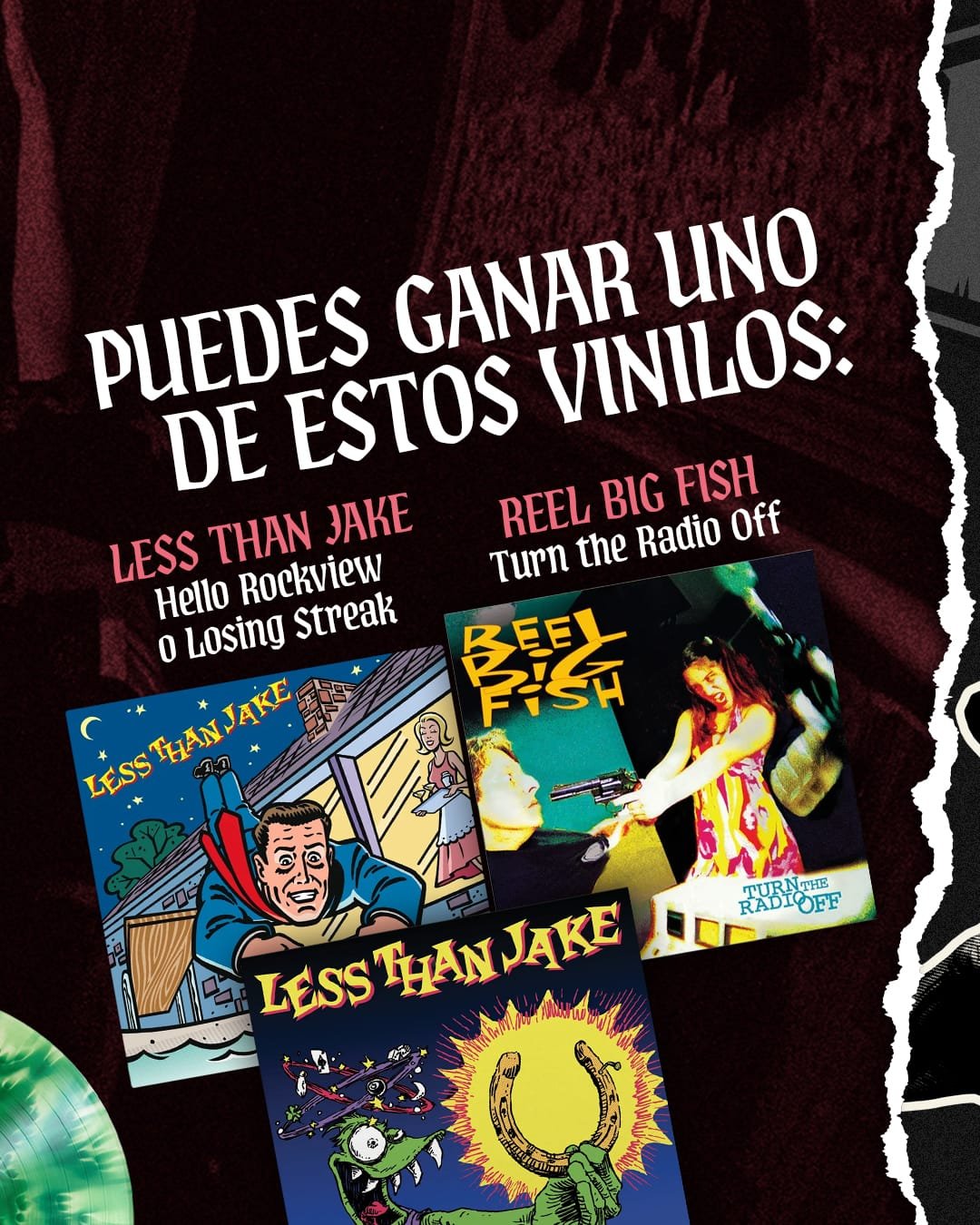
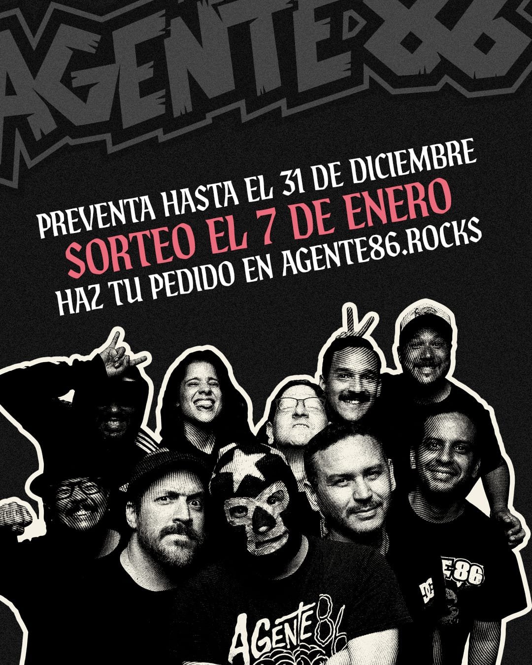
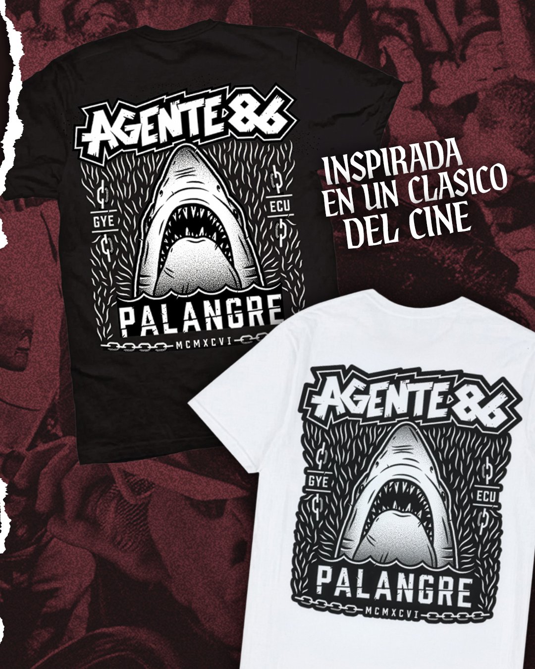
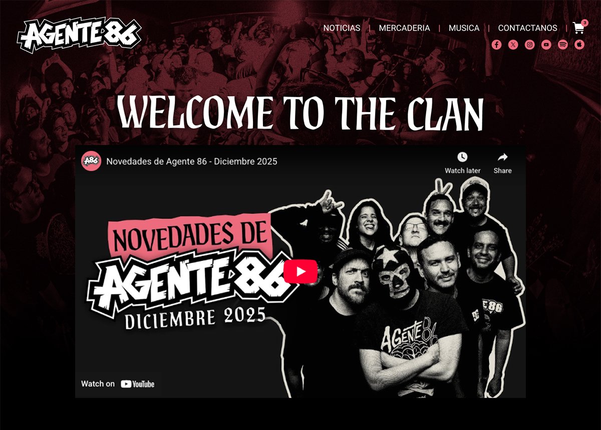
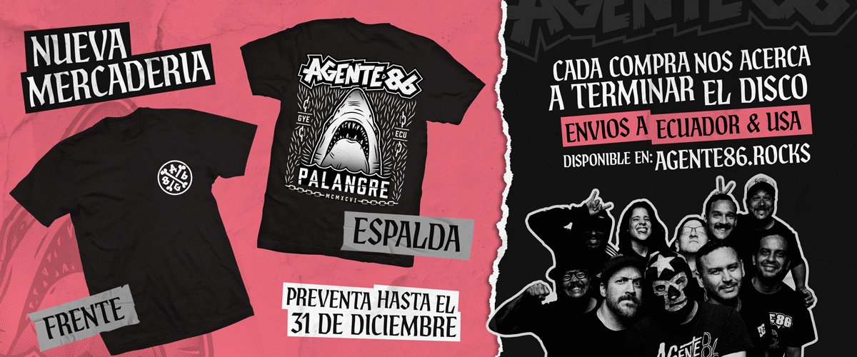
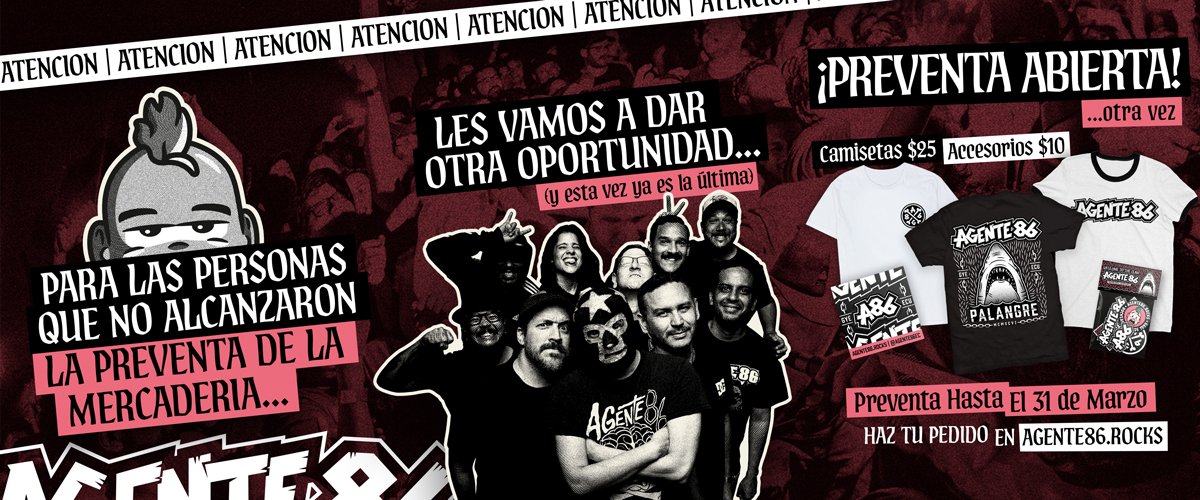
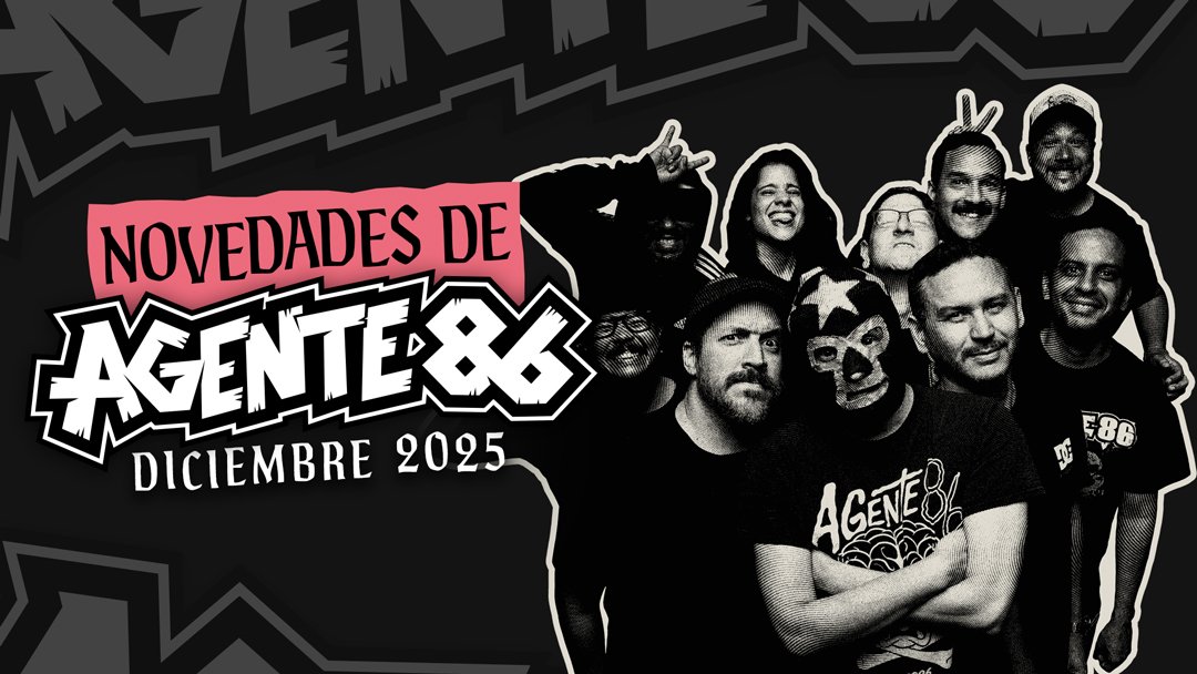
The campaign extended across the single artwork, two T-shirts, a sticker pack, an enamel pin, the band's website, social media, two email campaigns, and the music video.
I carried the same visual language across each touchpoint, creating a connected campaign rather than a collection of unrelated pieces. The A86 mark also became part of the band's motion identity, with an animation that transforms it into the full Agente 86 name.
One visual language, everywhere
The campaign extended across the single artwork, two T-shirts, a sticker pack, an enamel pin, the band's website, social media, two email campaigns, and the music video.
I carried the same visual language across each touchpoint, creating a connected campaign rather than a collection of unrelated pieces. The A86 mark also became part of the band's motion identity, with an animation that transforms it into the full Agente 86 name.
One visual language, everywhere
The campaign extended across the single artwork, two T-shirts, a sticker pack, an enamel pin, the band's website, social media, two email campaigns, and the music video.
I carried the same visual language across each touchpoint, creating a connected campaign rather than a collection of unrelated pieces. The A86 mark also became part of the band's motion identity, with an animation that transforms it into the full Agente 86 name.

Designed for the way people actually buy
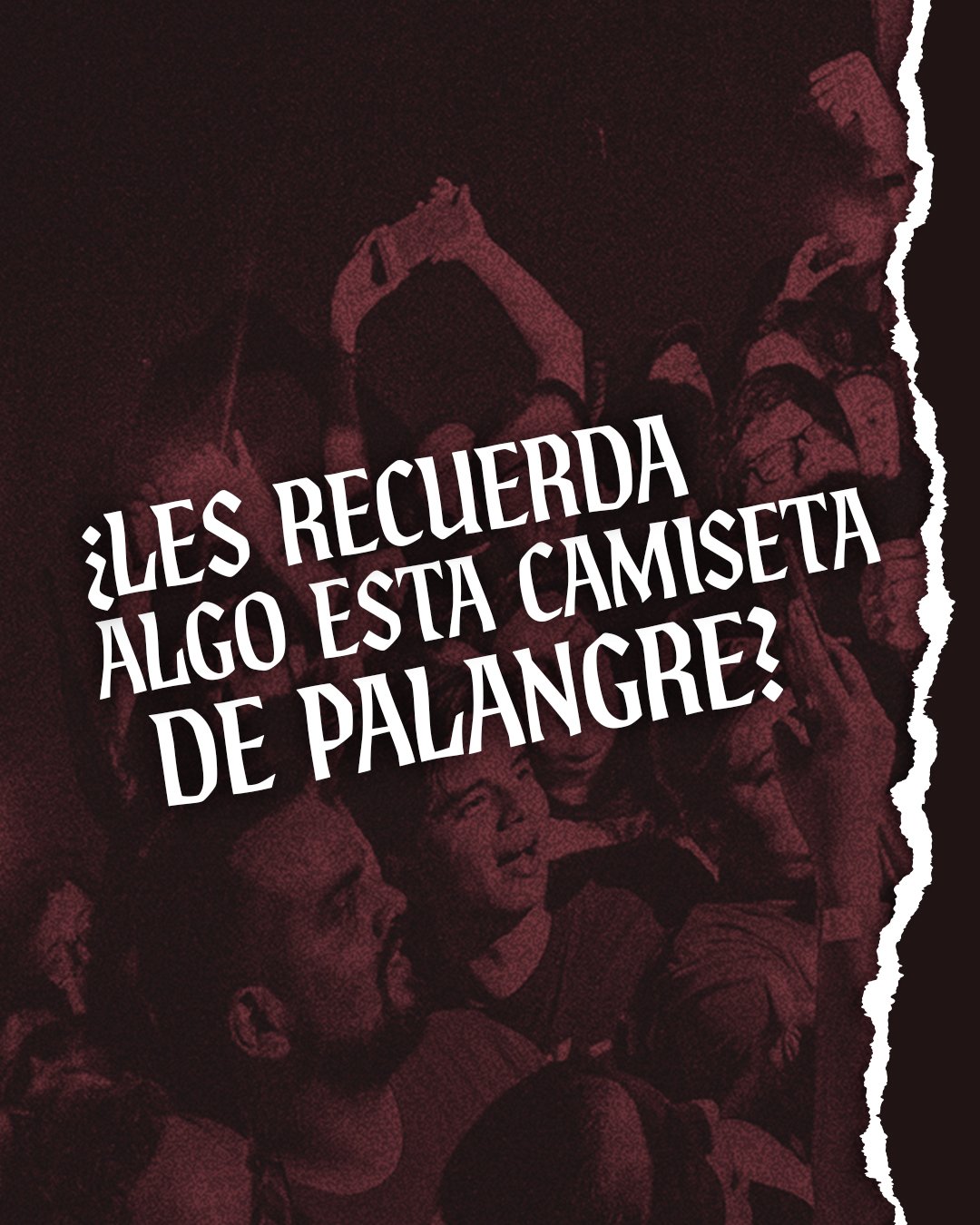
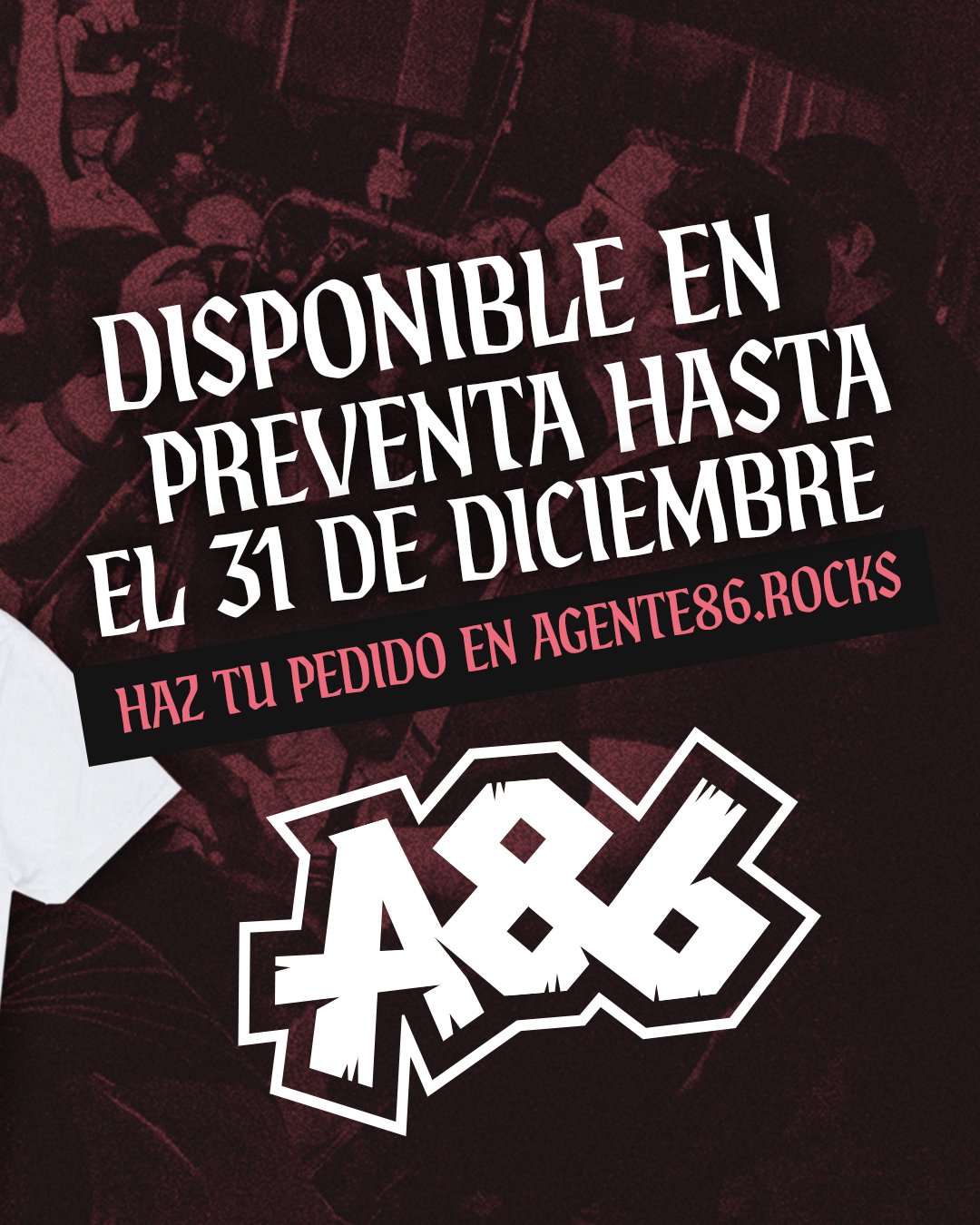
The website became the center of the merchandise pre-sale. Because online payments aren't as common in Ecuador, we designed the purchasing journey around collecting the order and customer information first, then having someone from the band follow up to complete the purchase.
It was a simple adjustment, but an important one: the experience needed to work for the people actually buying the merchandise.
Designed for the way people actually buy
The website became the center of the merchandise pre-sale. Because online payments aren't as common in Ecuador, we designed the purchasing journey around collecting the order and customer information first, then having someone from the band follow up to complete the purchase.
It was a simple adjustment, but an important one: the experience needed to work for the people actually buying the merchandise.
Designed for the way people actually buy
The website became the center of the merchandise pre-sale. Because online payments aren't as common in Ecuador, we designed the purchasing journey around collecting the order and customer information first, then having someone from the band follow up to complete the purchase.
It was a simple adjustment, but an important one: the experience needed to work for the people actually buying the merchandise.
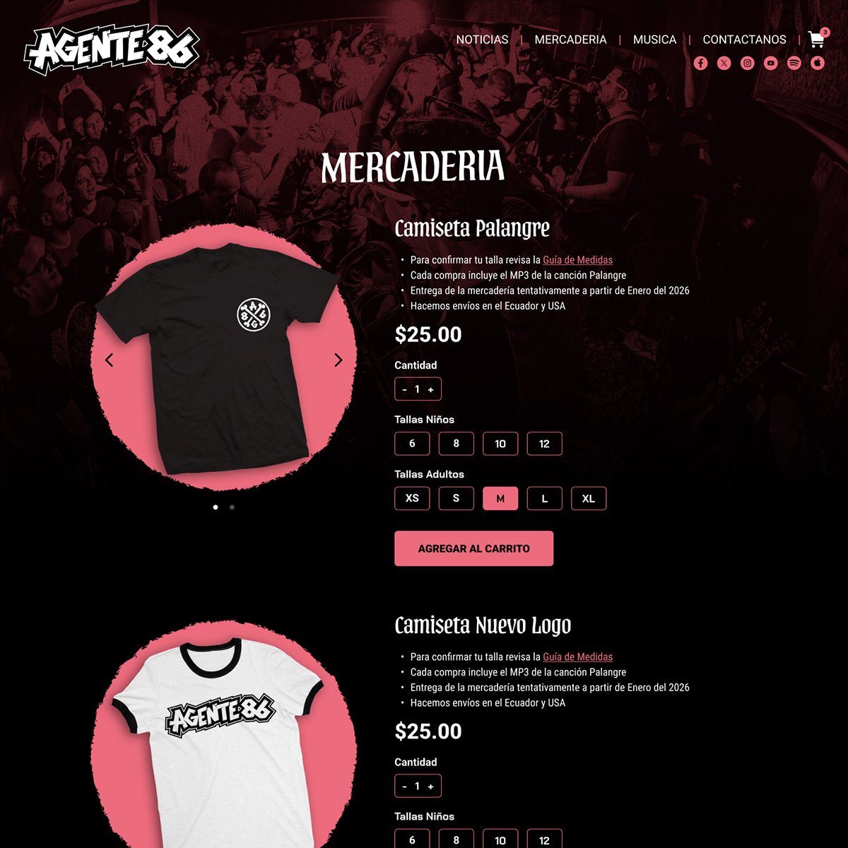
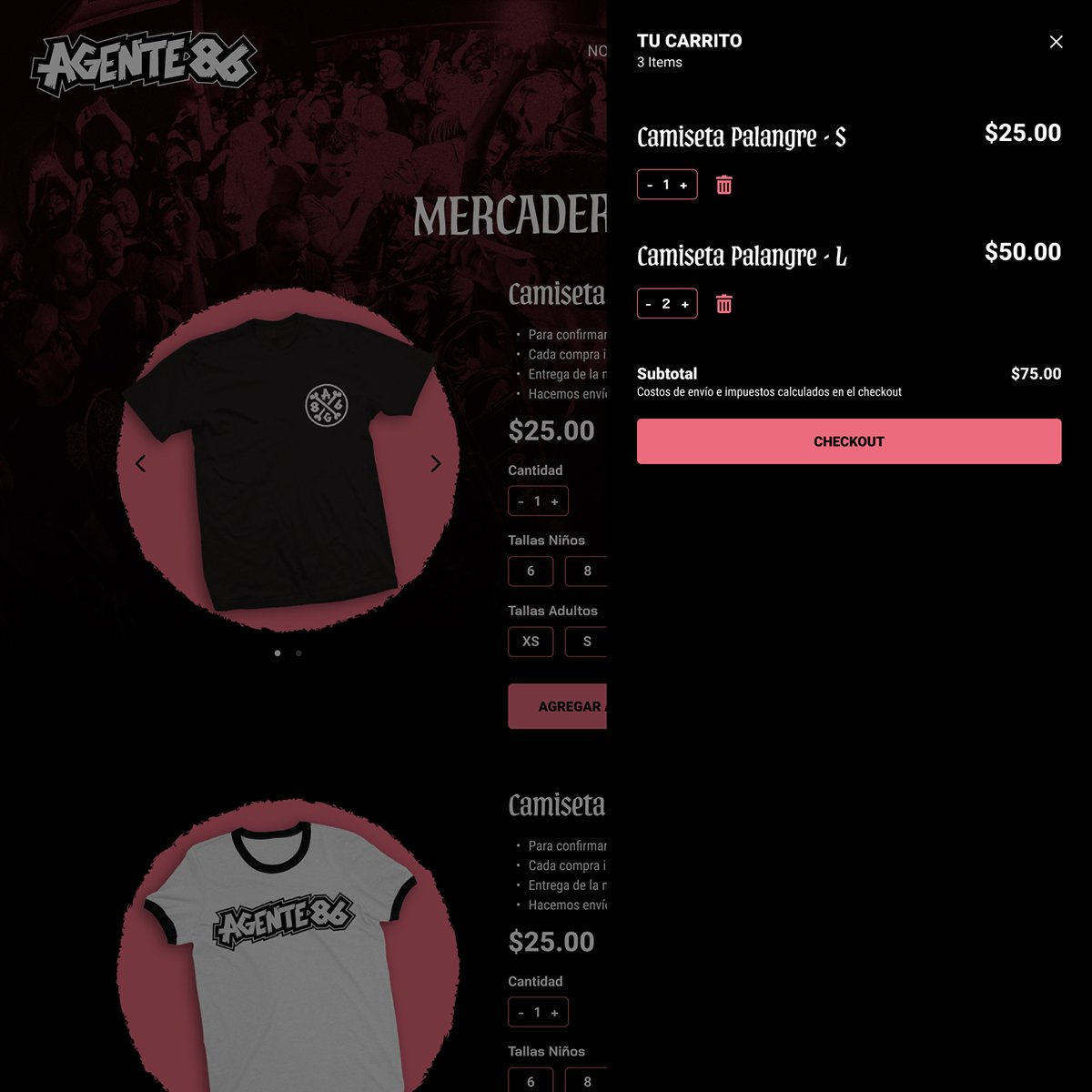
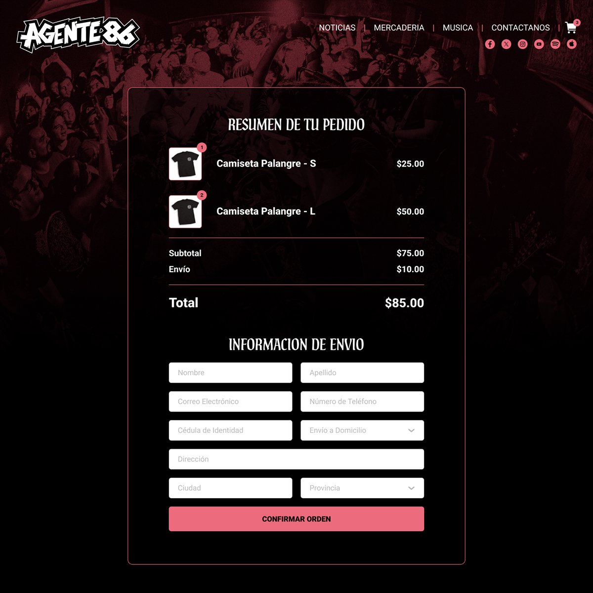
The pre-order experience was designed around local purchasing habits in Ecuador.
A comeback in one month
The campaign ran for just one month while we prepared for the new record. It was never meant to be a permanent rebrand. The goal was to make this chapter feel impactful and memorable while giving the band a stronger visual presence in the meantime.
For a band that had been largely inactive, the response was better than we expected. The campaign generated more than 30K social impressions, the merchandise pre-sale raised more funds than anticipated, and fans responded positively to both the new merch and the updated logo.
A comeback in one month
The campaign ran for just one month while we prepared for the new record. It was never meant to be a permanent rebrand. The goal was to make this chapter feel impactful and memorable while giving the band a stronger visual presence in the meantime.
For a band that had been largely inactive, the response was better than we expected. The campaign generated more than 30K social impressions, the merchandise pre-sale raised more funds than anticipated, and fans responded positively to both the new merch and the updated logo.
A comeback in one month
The campaign ran for just one month while we prepared for the new record. It was never meant to be a permanent rebrand. The goal was to make this chapter feel impactful and memorable while giving the band a stronger visual presence in the meantime.
For a band that had been largely inactive, the response was better than we expected. The campaign generated more than 30K social impressions, the merchandise pre-sale raised more funds than anticipated, and fans responded positively to both the new merch and the updated logo.
A comeback in one month
The campaign ran for just one month while we prepared for the new record. It was never meant to be a permanent rebrand. The goal was to make this chapter feel impactful and memorable while giving the band a stronger visual presence in the meantime.
For a band that had been largely inactive, the response was better than we expected. The campaign generated more than 30K social impressions, the merchandise pre-sale raised more funds than anticipated, and fans responded positively to both the new merch and the updated logo.

This was more than a new single release. It was a way to bring Agente 86 back into the conversation, give the band a new visual voice, and set the stage for what comes next.
This was more than a new single release. It was a way to bring Agente 86 back into the conversation, give the band a new visual voice, and set the stage for what comes next.
This was more than a new single release. It was a way to bring Agente 86 back into the conversation, give the band a new visual voice, and set the stage for what comes next.
This was more than a new single release. It was a way to bring Agente 86 back into the conversation, give the band a new visual voice, and set the stage for what comes next.
More Projects
Made it this far?
We should probably talk 💬

