
KlientBoost
The GIF that keeps on giving
I first started working with KlientBoost in 2015, when the company was a five-person team, and their entire brand was just a logo.
I was originally hired to create three animated infographics called The 10 Minute AdWords Workouts. One project turned into another, then another. Eventually, the CEO offered me a full-time position because I had become someone he could trust to turn his ideas into something that felt like KlientBoost.
Since 2015, and still going.
The GIF that keeps on giving
I first started working with KlientBoost in 2015, when the company was a five-person team, and their entire brand was just a logo.
I was originally hired to create three animated infographics called The 10 Minute AdWords Workouts. One project turned into another, then another. Eventually, the CEO offered me a full-time position because I had become someone he could trust to turn his ideas into something that felt like KlientBoost.
Since 2015, and still going.
The GIF that keeps on giving
I first started working with KlientBoost in 2015, when the company was a five-person team, and their entire brand was just a logo.
I was originally hired to create three animated infographics called The 10 Minute AdWords Workouts. One project turned into another, then another. Eventually, the CEO offered me a full-time position because I had become someone he could trust to turn his ideas into something that felt like KlientBoost.
Since 2015, and still going.
It started with almost nothing
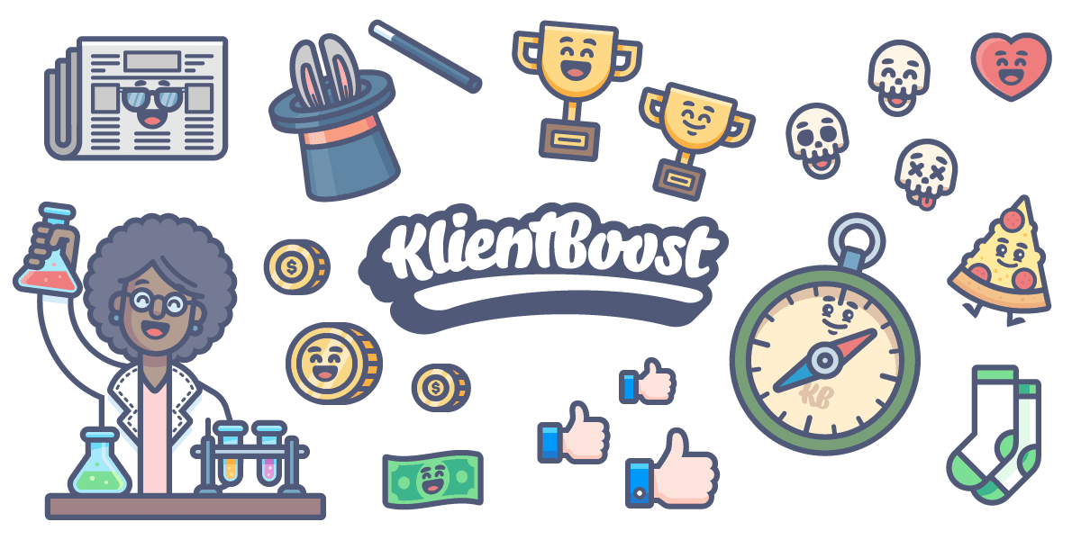
When I arrived, there wasn't really a visual identity to work with. There was just a logo. The personality came from the CEO's writing and the work we started creating together.
I wasn't trying to build a long-term brand system. I was trying to do great work and impress a client. But as more projects came in, illustration became a major part of the brand, and a playful point of view became part of everything we made.
The goal was simple: have fun without looking like we weren't serious about the work.
It started with almost nothing
When I arrived, there wasn't really a visual identity to work with. There was just a logo. The personality came from the CEO's writing and the work we started creating together.
I wasn't trying to build a long-term brand system. I was trying to do great work and impress a client. But as more projects came in, illustration became a major part of the brand, and a playful point of view became part of everything we made.
The goal was simple: have fun without looking like we weren't serious about the work.
It started with almost nothing
When I arrived, there wasn't really a visual identity to work with. There was just a logo. The personality came from the CEO's writing and the work we started creating together.
I wasn't trying to build a long-term brand system. I was trying to do great work and impress a client. But as more projects came in, illustration became a major part of the brand, and a playful point of view became part of everything we made.
The goal was simple: have fun without looking like we weren't serious about the work.
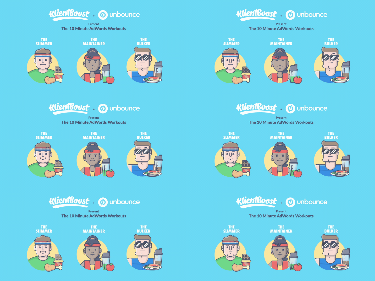
The 10 Minute AdWords Workouts — the first project that started it all, 2015.
Finding the KlientBoost look
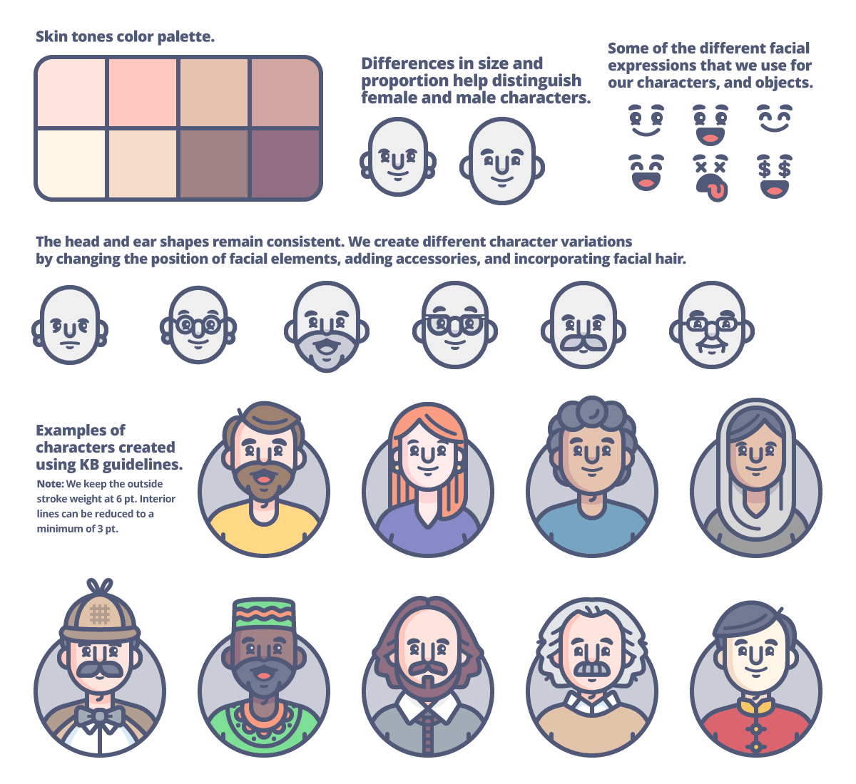
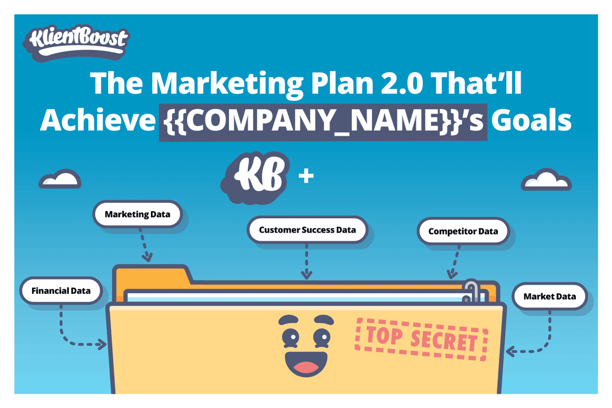
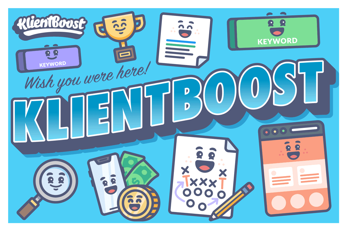
The brand's personality comes from a balance of playful and polished. I developed a set of visual rules around consistent strokes, rounded edges, simplified shapes, and a controlled color palette
We often described the goal as making things feel “cute”—but never childish. That thinking eventually grew into a flexible illustration system, with reusable shapes, eyes, mouths, and other building blocks that could create an almost unlimited number of characters while still feeling unmistakably KlientBoost.
Finding the KlientBoost look
The brand's personality comes from a balance of playful and polished. I developed a set of visual rules around consistent strokes, rounded edges, simplified shapes, and a controlled color palette
We often described the goal as making things feel “cute”—but never childish. That thinking eventually grew into a flexible illustration system, with reusable shapes, eyes, mouths, and other building blocks that could create an almost unlimited number of characters while still feeling unmistakably KlientBoost.
Finding the KlientBoost look
The brand's personality comes from a balance of playful and polished. I developed a set of visual rules around consistent strokes, rounded edges, simplified shapes, and a controlled color palette
We often described the goal as making things feel “cute”—but never childish. That thinking eventually grew into a flexible illustration system, with reusable shapes, eyes, mouths, and other building blocks that could create an almost unlimited number of characters while still feeling unmistakably KlientBoost.
Playful, not childish
That balance became one of the defining characteristics of the brand. Typography stayed intentionally simple because the illustration already carried so much personality. We kept things easy to read and added small moments of fun where they mattered.
As the brand grew, that same visual language had to work across campaigns, digital experiences, motion, and physical applications. The goal wasn't to make everything look the same, but to make sure everything felt like it came from the same place.
Playful, not childish
That balance became one of the defining characteristics of the brand. Typography stayed intentionally simple because the illustration already carried so much personality. We kept things easy to read and added small moments of fun where they mattered.
As the brand grew, that same visual language had to work across campaigns, digital experiences, motion, and physical applications. The goal wasn't to make everything look the same, but to make sure everything felt like it came from the same place.
Playful, not childish
That balance became one of the defining characteristics of the brand. Typography stayed intentionally simple because the illustration already carried so much personality. We kept things easy to read and added small moments of fun where they mattered.
As the brand grew, that same visual language had to work across campaigns, digital experiences, motion, and physical applications. The goal wasn't to make everything look the same, but to make sure everything felt like it came from the same place.
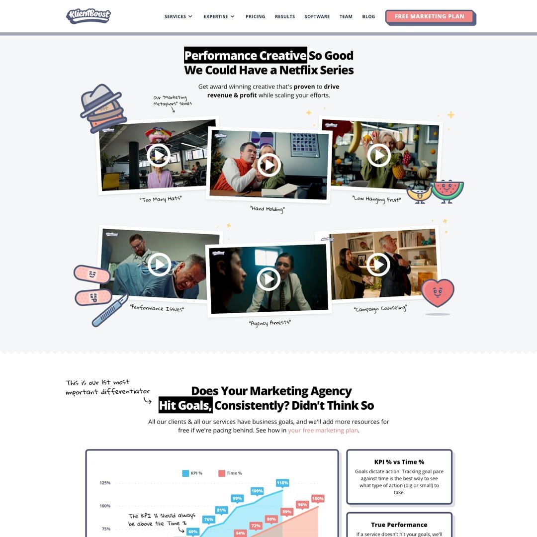
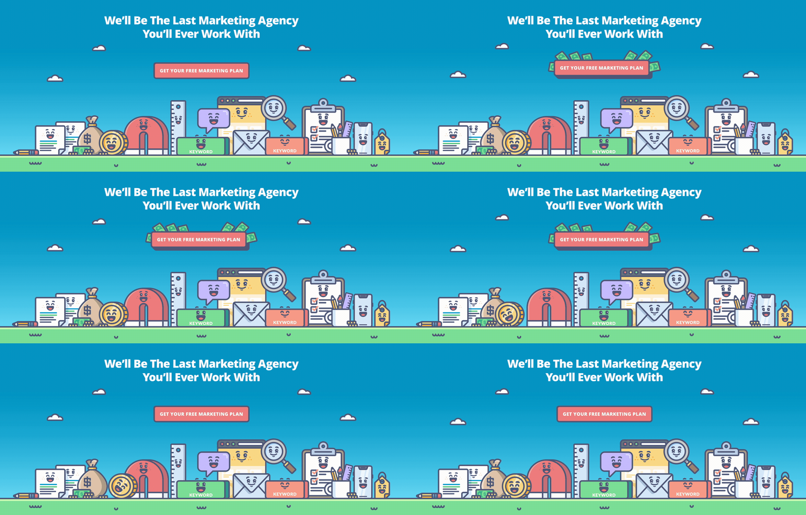
Evolving the system
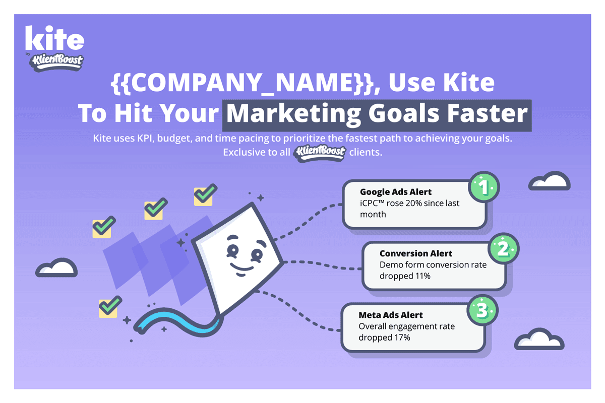
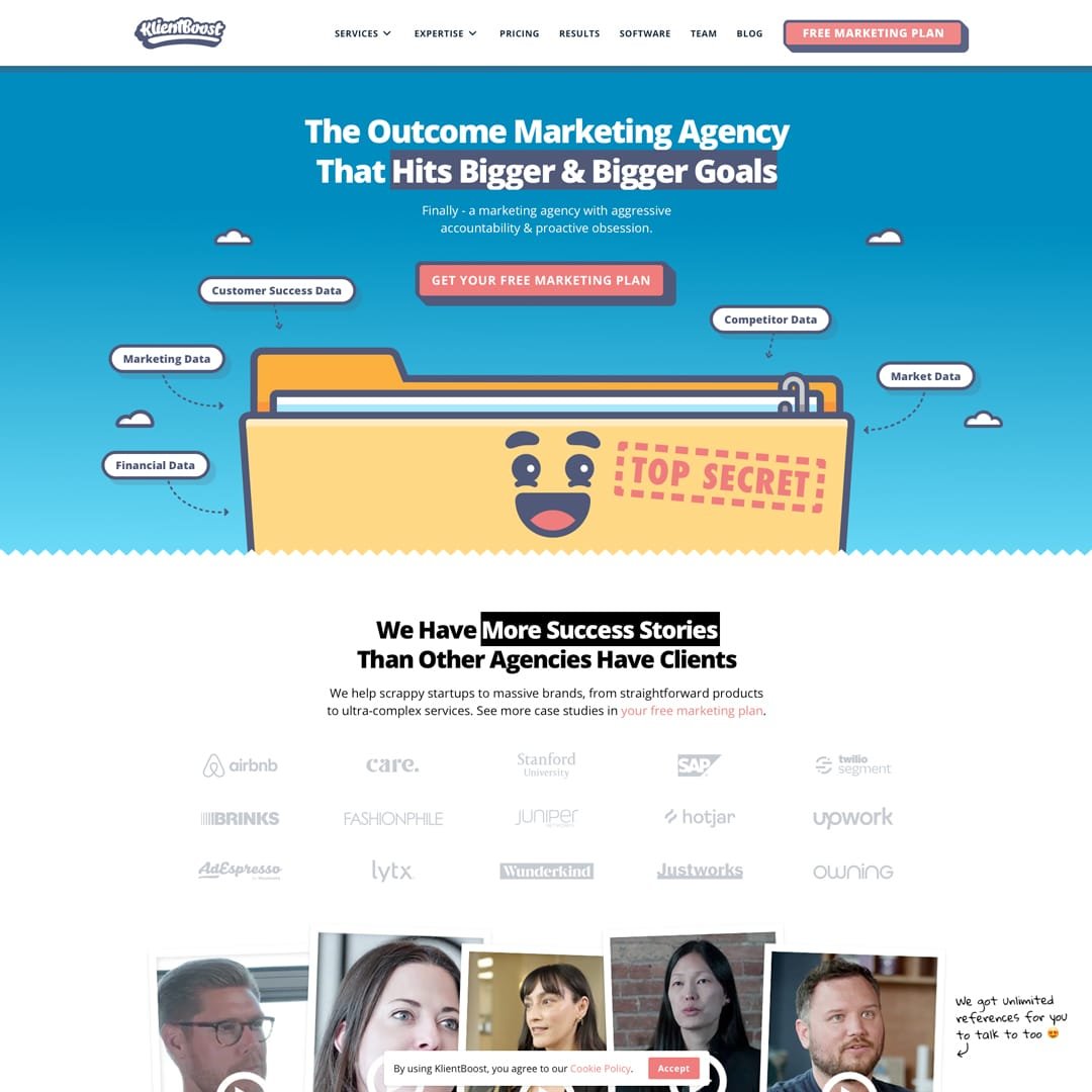
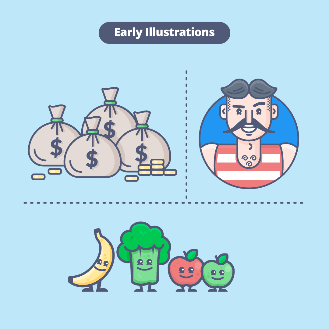
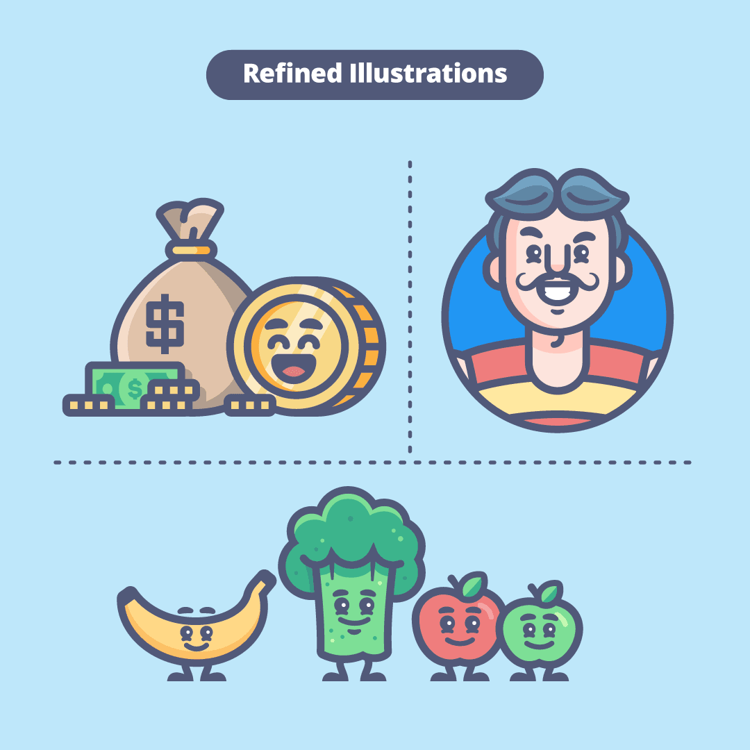
The first illustration style wasn't designed with a long lifespan in mind. As the brand grew, I refined the shapes, proportions, and strokes, rounded the edges, and cleaned up the color palette to give everything a friendlier, more polished feel. I also created a template and set of reusable building blocks to make starting new illustrations easier and keep the style consistent.
The broader brand evolved in much the same way. I refined the color palette, improved the primary blue for better readability, and eventually introduced a custom gradient and heavier logo stroke that connected the brand more closely to the illustration language. I also created a spacing grid to help the logo feel optically centered, accounting for the shapes and extensions in the lettering.
It wasn't one big rebrand. It was a series of deliberate refinements that made the brand more consistent and polished without taking away its personality.
Evolving the system
The first illustration style wasn't designed with a long lifespan in mind. As the brand grew, I refined the shapes, proportions, and strokes, rounded the edges, and cleaned up the color palette to give everything a friendlier, more polished feel. I also created a template and set of reusable building blocks to make starting new illustrations easier and keep the style consistent.
The broader brand evolved in much the same way. I refined the color palette, improved the primary blue for better readability, and eventually introduced a custom gradient and heavier logo stroke that connected the brand more closely to the illustration language. I also created a spacing grid to help the logo feel optically centered, accounting for the shapes and extensions in the lettering.
It wasn't one big rebrand. It was a series of deliberate refinements that made the brand more consistent and polished without taking away its personality.
Evolving the system
The first illustration style wasn't designed with a long lifespan in mind. As the brand grew, I refined the shapes, proportions, and strokes, rounded the edges, and cleaned up the color palette to give everything a friendlier, more polished feel. I also created a template and set of reusable building blocks to make starting new illustrations easier and keep the style consistent.
The broader brand evolved in much the same way. I refined the color palette, improved the primary blue for better readability, and eventually introduced a custom gradient and heavier logo stroke that connected the brand more closely to the illustration language. I also created a spacing grid to help the logo feel optically centered, accounting for the shapes and extensions in the lettering.
It wasn't one big rebrand. It was a series of deliberate refinements that made the brand more consistent and polished without taking away its personality.
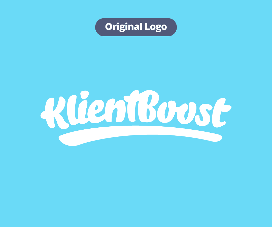
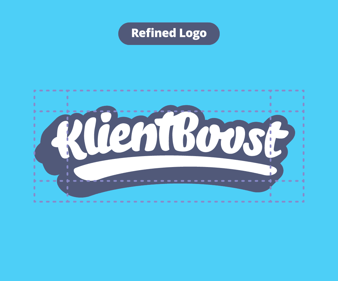
I introduced a heavier stroke, improved the color contrast, and created a custom spacing grid to make the logo feel more balanced and optically centered.
Pushing the brand further
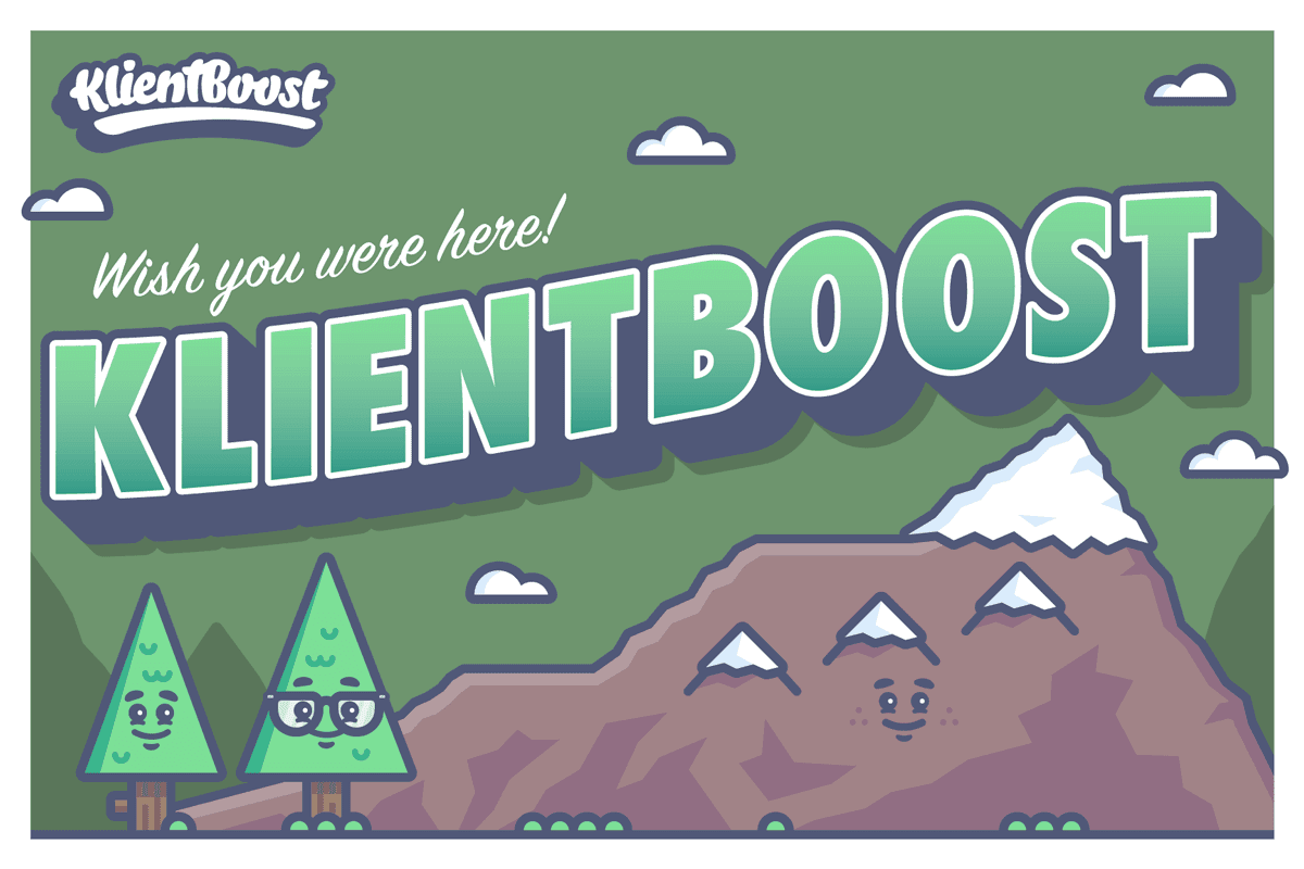
I'm particularly proud of the character library, along with projects like Marketing Maturity Mountain and KlientBoost Kitchen. They gave us opportunities to take the visual language somewhere new while keeping it recognizably KlientBoost.
Pushing the brand further
I'm particularly proud of the character library, along with projects like Marketing Maturity Mountain and KlientBoost Kitchen. They gave us opportunities to take the visual language somewhere new while keeping it recognizably KlientBoost.
Pushing the brand further
I'm particularly proud of the character library, along with projects like Marketing Maturity Mountain and KlientBoost Kitchen. They gave us opportunities to take the visual language somewhere new while keeping it recognizably KlientBoost.
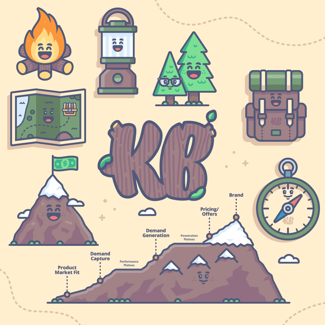
Marketing Maturity Mountain.
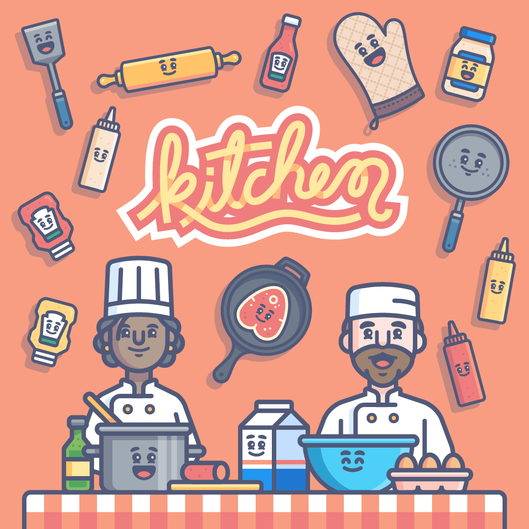
KlientBoost Kitchen.
Since 2015 and beyond
I joined KlientBoost when it was a five-person company, eventually joined full-time, and continued working with them as a freelancer. Today, I'm still one of the people they call when a major creative challenge comes up.
KlientBoost has played a huge role in my career. It's the first company that truly trusted me to take the reins of a growing brand, and it taught me what it means to build a visual language that can evolve without losing itself.
I didn't just make a lot of things for KlientBoost.
I helped make it look like KlientBoost.
Since 2015 and beyond
I joined KlientBoost when it was a five-person company, eventually joined full-time, and continued working with them as a freelancer. Today, I'm still one of the people they call when a major creative challenge comes up.
KlientBoost has played a huge role in my career. It's the first company that truly trusted me to take the reins of a growing brand, and it taught me what it means to build a visual language that can evolve without losing itself.
I didn't just make a lot of things for KlientBoost.
I helped make it look like KlientBoost.
Since 2015 and beyond
I joined KlientBoost when it was a five-person company, eventually joined full-time, and continued working with them as a freelancer. Today, I'm still one of the people they call when a major creative challenge comes up.
KlientBoost has played a huge role in my career. It's the first company that truly trusted me to take the reins of a growing brand, and it taught me what it means to build a visual language that can evolve without losing itself.
I didn't just make a lot of things for KlientBoost.
I helped make it look like KlientBoost.
More Projects
Made it this far?
We should probably talk 💬

